COMPANY
- Home
- About the CompanyCI
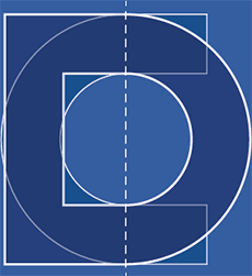
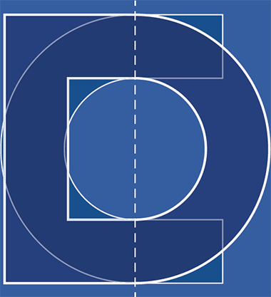
LOGO Symbolism
-

 A representation of the history and skills accumulated by DONG IN over the years, as well as its vision for the future.
We required a CI that could portray all these aspects in the most concise, no-frills manner possible.
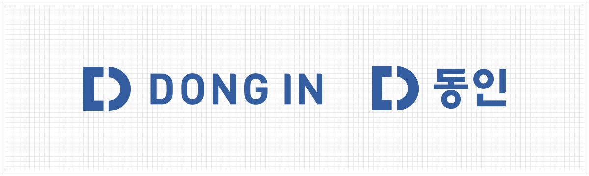
We began with the ‘ㄷ’ and ‘ㅇ’, the two consonants of the Korean spelling of DONG IN (동인). -
 We were able to best portray the identity behind the name DONG IN concisely and showcase the company’s global vision by ‘combining’ the two consonants.
This is the new CI for DONG IN, the company developing its global vision based on its history and skills. -

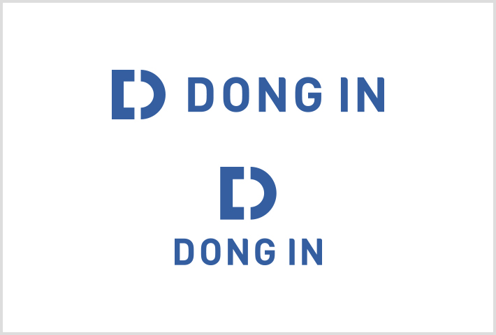
 The two consonants in DONG IN, ‘ㄷ’ and ‘ㅇ’, have combined to form the letter ‘D’ of the alphabet.
 -

 Originating from the Korean spelling of the company’s name, the letter ‘D’ leads back to the English spelling of ‘DONG IN.’
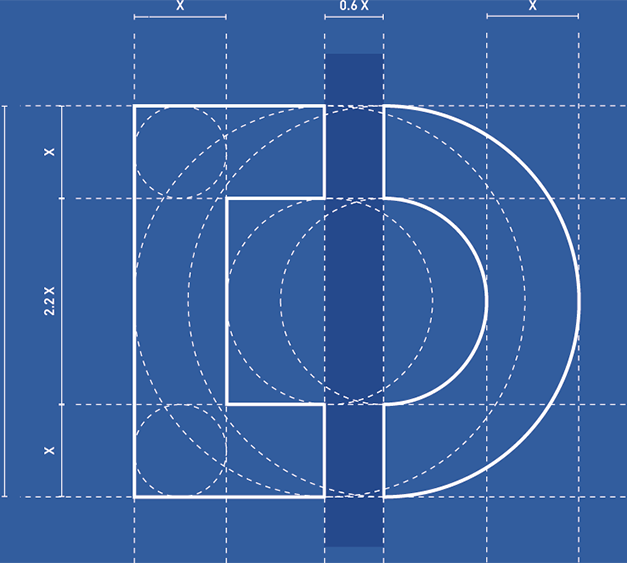
LOGO GRID SYSTEM
A logo grid is a system necessary for producing logos on mediums that make it difficult to recreate them via computer printing or on large billboards.
Excepting special case scenarios, the original logo data must always be resized (enlarged or shrunk) and copied. However, if the traits of the medium on which the logo is being applied to makes the use of the original file impossible, then the logo must be produced accurately according to the proportional regulations of the provided logo grid system before being used.

LOGO SYSTEM VARIATION
The main logo is a symbol that represents DONG IN’s image, and is a core element of our brand system.
You may not arbitrarily change its shape or colors, and you must comply with the principles of logo application in accordance with the regulations in order to prevent DONG IN’s image from being tarnished as a result of distortion, deformation, abuse and misuse, etc. of identity.
When editing the logo through resizing, copying, etc., the ratio of the main logo must remain the same as the ratio of the original data.